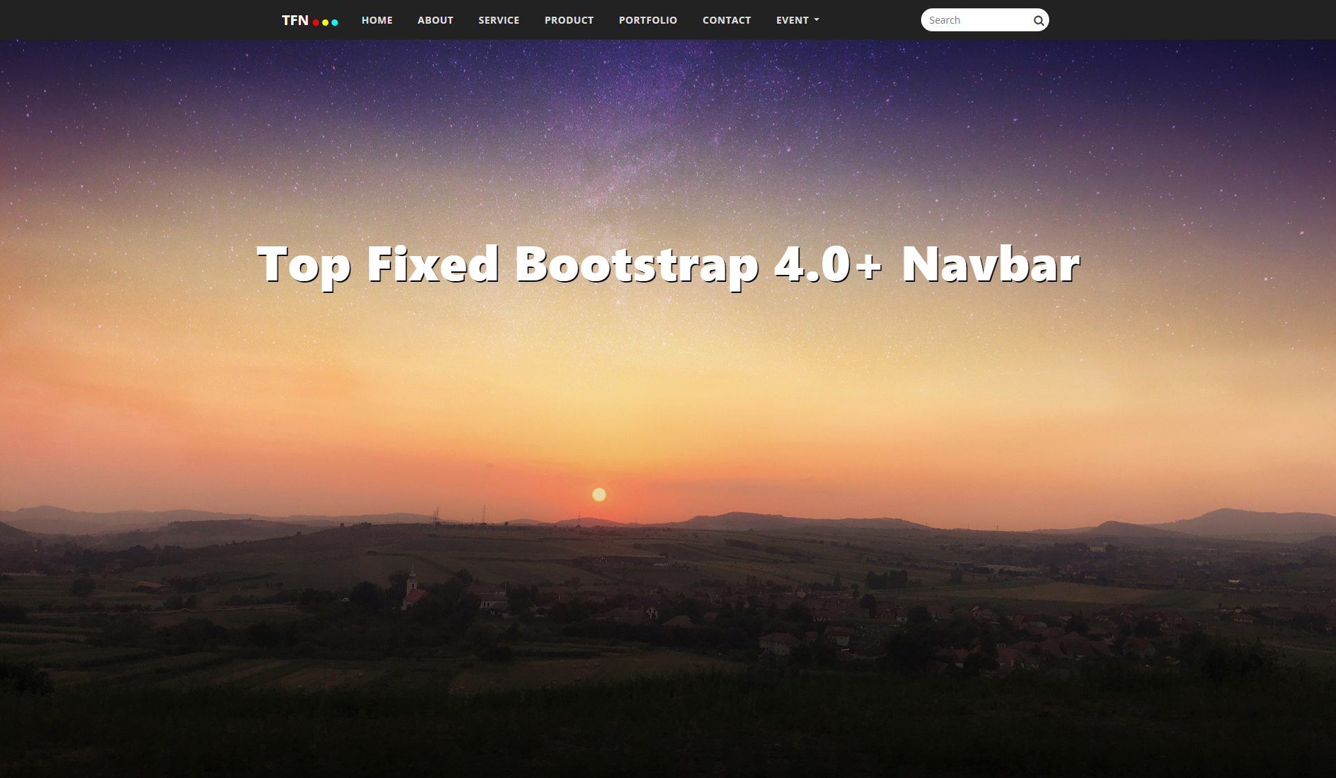
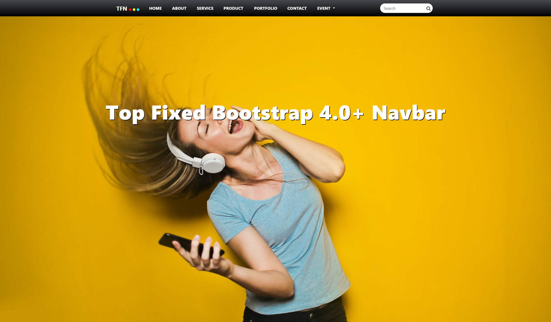
Showcase Navbar
Design Collection
The My Navbar Top Fixed Responsive Navigation is a professional CSS2 & CSS3 jQuery Top Fixed Responsive Navigation plugin compatible with Bootstrap 3 & 4 Framework. This Navigation comes with horizontal and sticky version and 10 different design.
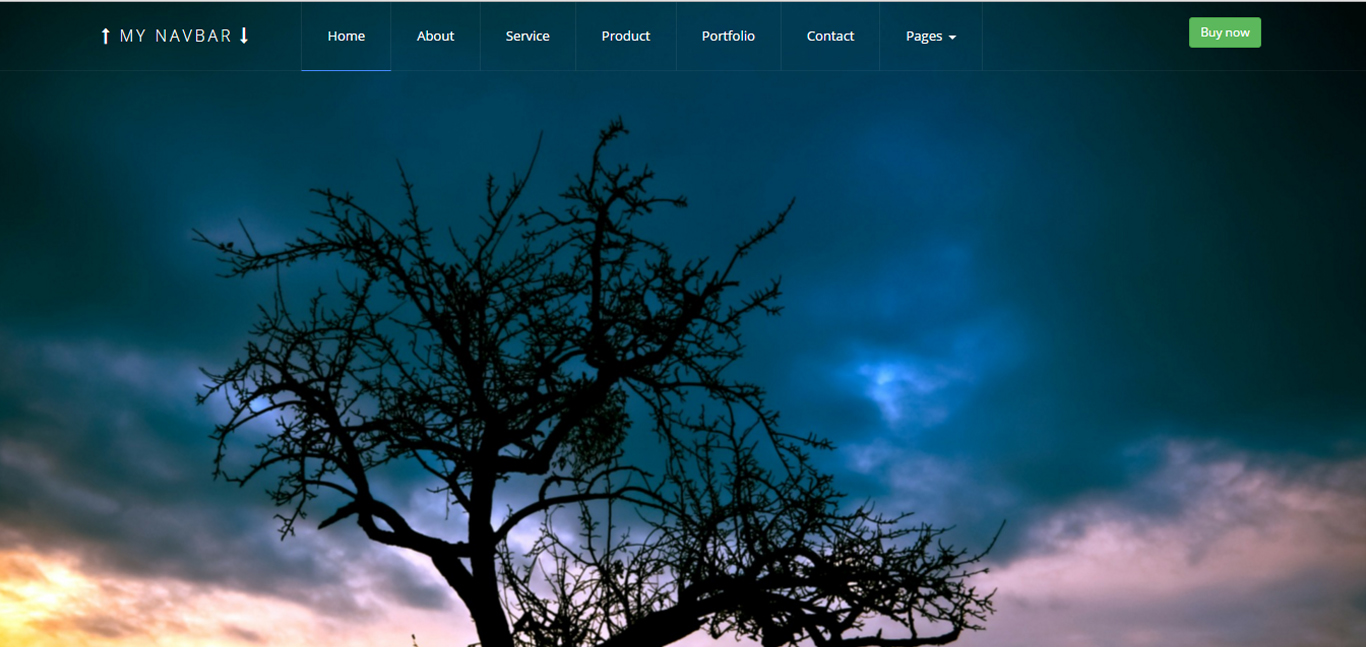
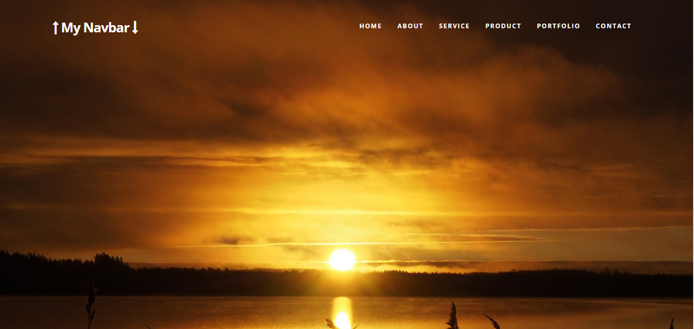
Buy Now1 Top Fixed Navbar
The My Navbar Top Fixed Responsive Navigation is a professional CSS2 & CSS3 jQuery Top Fixed Responsive Navigation plugin compatible with Bootstrap 3 & 4 Framework.
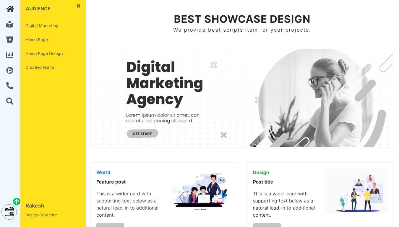
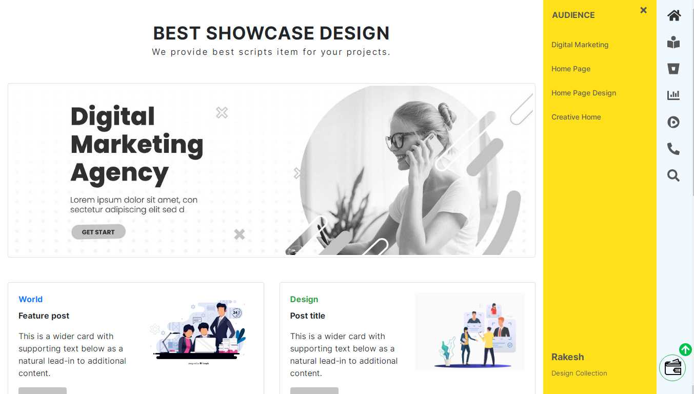
2 Left & Right Sidebar Navbar
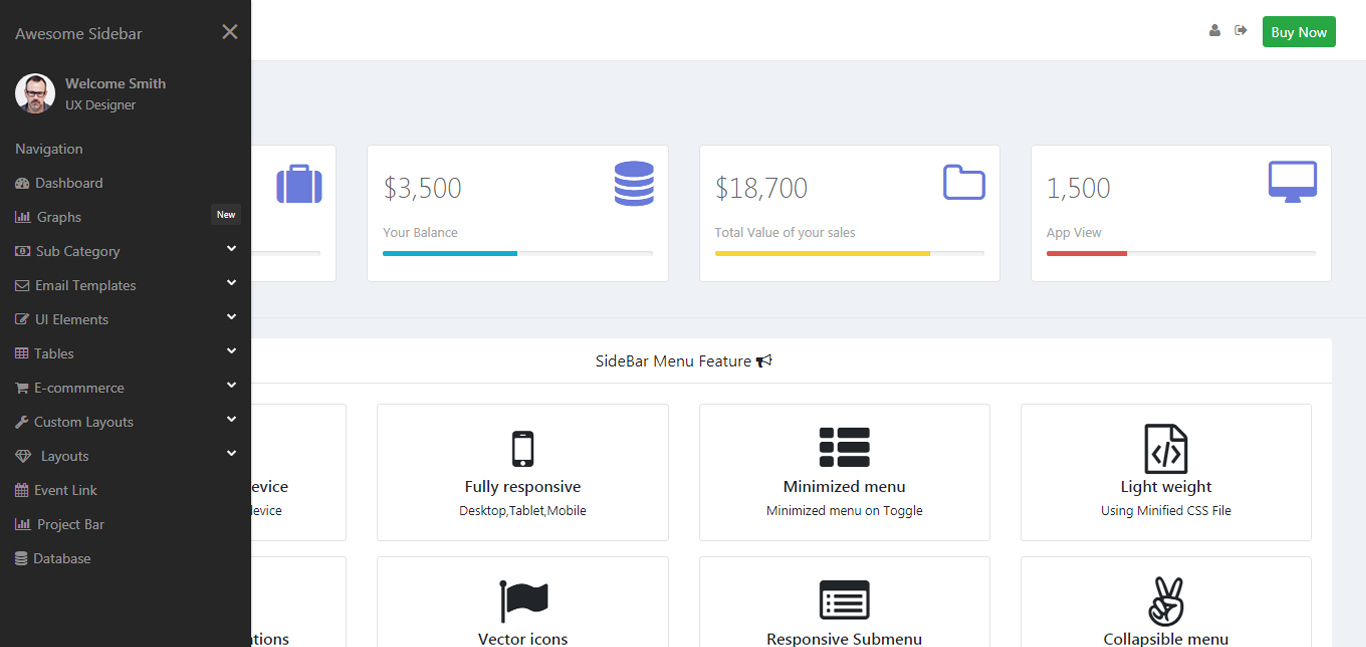
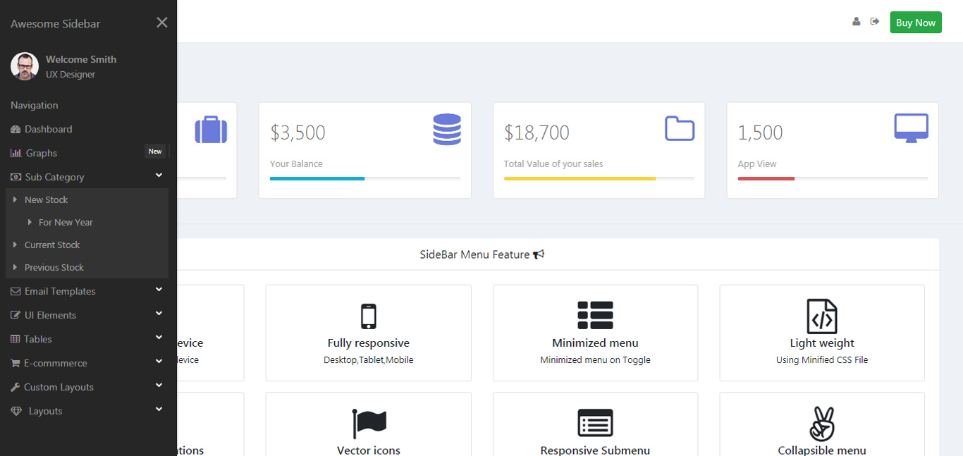
ICON – Right & Left Sidebar Navigation compatible with bootstrap 4.0+ framework used. This Left Sidebar Navigation comes with such as right sidebar, left sidebar, top and bottom and 12 different design showcase.
3 Mega Menu
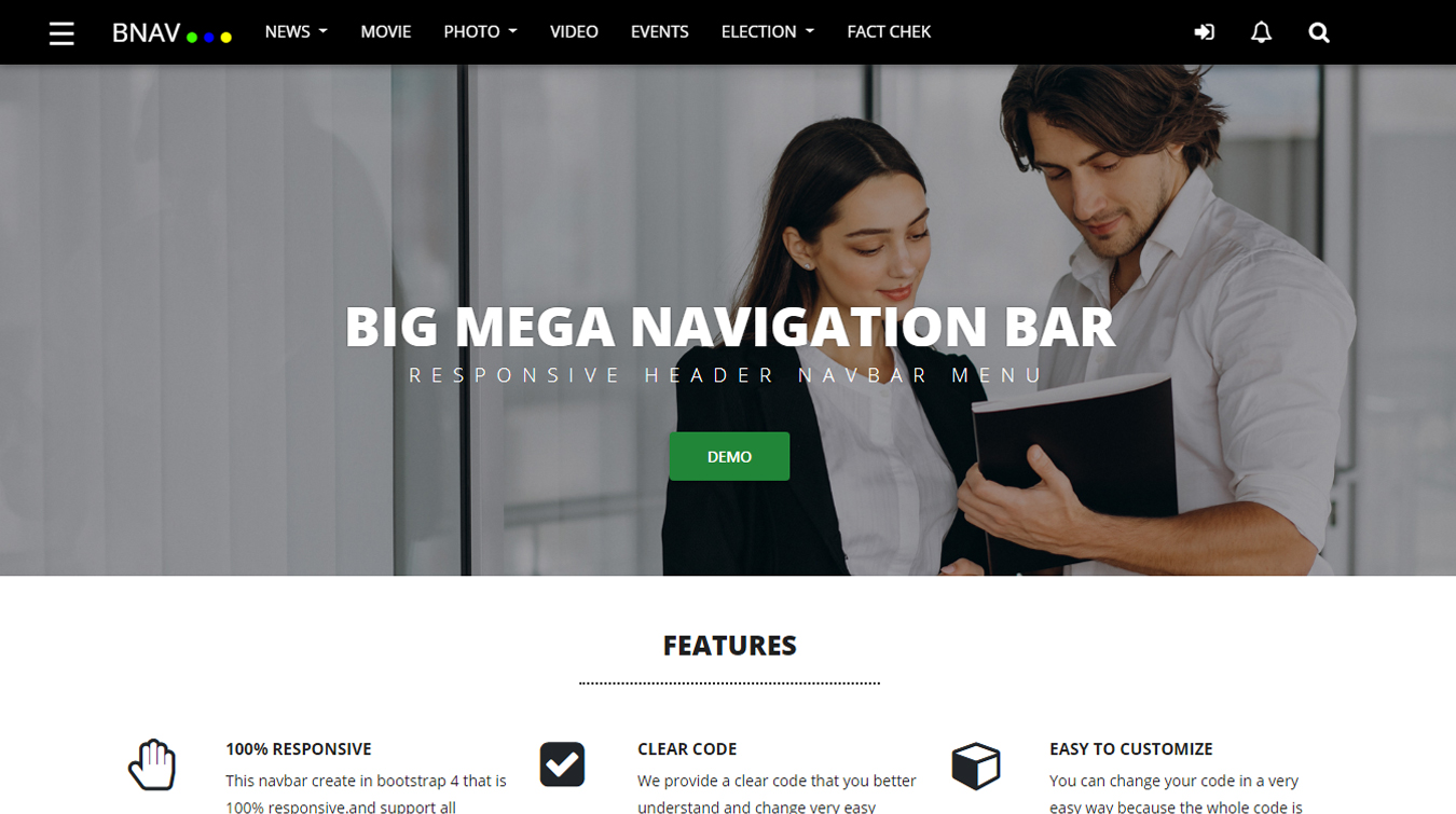
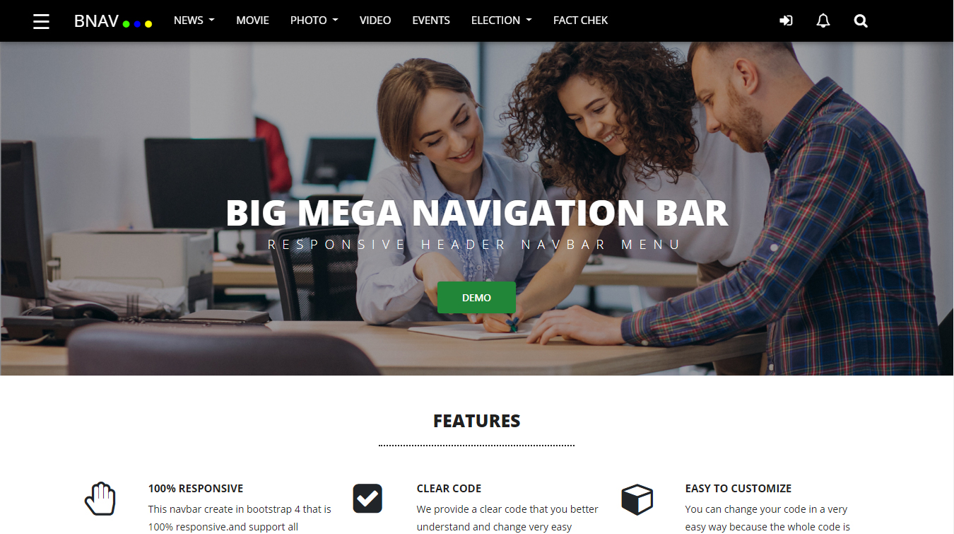
Big Mega Navigartion Bar Responsive header Navbar Menu Icone – Navigation compatible with bootstrap 4.0+ framework used. This Bullet List Navbar, Animation Bullet List, Animation To Right Navigation comes with such as right sidebar, left sidebar, top and bottom and 12 different design showcase.
4 Nova Navbar
vertical menu bootstrap bootstrap vertical menu vertical menu bar in html and css free download css vertical menu examples vertical menu bar in cssjquery vertical menu bar free download vertical menu bar vertical menu jquery free download.
5 Flat Navbar
A flat navbar, also known as a flat navigation bar, is a design element commonly used in web and user interface design. It is characterized by its minimalist and sleek appearance, featuring simple, clean, and flat design elements without excessive gradients, shadows, or other embellishments.
Client Satisfaction
We are pride of ourselves on transforming our clients for the better
helping them to grow & making them more resilient.
45%
Success Rate
500K
Satisfy customer
1M
Happy Client
25+
Years Experience
9 Plus Feature Highlights
Feature Highlights
Visual Weather has a number of advanced feature that will take
the forecasting capabilities to the next level.
Customize with Sass
We built using Sass. Easily change colors, typography and much more. It is the most mature, stable, and powerful CSS extension language in the world.

Node Templating
No need to write huge amount of HTML, if you donot want to. Pug provides features not available in plain HTML like variables, includes, mixins etc.

Built With Bootstrap 5
E-commerce With front-end solution based on Bootstrap 5 - the world's most popular responsive, mobile-first front-end component library.

40+ Components
All default Bootstrap 5 components we introduces lots of new flexible, customizable and reusable elements you can use across the website.

Mobile Friendly Interface
It's not a surprise that nowadays over 70% of users shop online using their mobile devices. We 100% responsive and optimized for small touch screens.

Google Fonts
we uses Google fonts which are free, fast to load and of very high quality. Currently Google fonts library includes 870+ font families to choose from.

Touch-enabled Sliders
Ensure great user experience on handheld devices, especially when it comes to such frequently used interface component as slider.

Vector Based Icons
Font-based icon pack to ensure that infographics and interface icons look sharp on any device with any screen resolution and pixel density.

W3C Valid HTML Code
All HTML files are checked via W3C validator to ensure 100% valid code. As you probably know invalid HTML limits innovation, but We innovative.

Customize with Sass
We built using Sass. Easily change colors, typography and much more. It is the most mature, stable, and powerful CSS extension language in the world.

Node Templating Engine
No need to write huge amount of HTML, if you donot want to. Pug provides features not available in plain HTML like variables, includes, mixins etc.

Built With Bootstrap 5
E-commerce With front-end solution based on Bootstrap 5 - the world's most popular responsive, mobile-first front-end component library.
Thank you so much for helping out with my customers while I've been away.
Carolyn Ortiz
100+ Our customers
Lori Stevens
Digital Marketing Head
Billy Vats
Content Writing Head
4.5/5.0
Based on 3265 ratings
It's such a good feeling to know that we can take time out when needed and the team are here to not just support our customers but support each other too..
Dennis Barrett
Some valuable feedback from our customer
Thank you so much for helping out with my customers while I've been away.
© Copyright-22 Design Collection. All rights reserved
